This article may contain affiliate / compensated links. For full information, please see our disclaimer here.
You’ve probably heard over and over again that content is king when it comes to blogging. And if that’s true, does blog design even matter?
Well, think of it this way…
if a blog is a house, the blog design is the exterior.
If the exterior is good looking, attractive, and warm, you’re much more inclined to step inside. On the other hand, if the house is run down and little attention has been paid to it, you’re much more likely to turn around and head to the next house on the block.
That’s what makes blog design so important!
It’s the first impression visitors get when they come to your blog and it can heavily influence whether they stay on… or click away.
In this article, I’ll show you the importance of blog design when it comes to building a captivating website and give you several elements to consider when it comes to designing your own blog.
Finally, I wrap up with examples of 10 blogs with stellar blog design so that you can see great design in action.
If you’re hoping to learn a thing or two about blog design, you’re certainly in the right place!
Does Blog Design Really Matter?
In short, the answer to this question is yes, blog design does matter.
Having a visually attractive blog can go a long way when it comes to keeping your audience on your blog, converting readers, and enticing them to return to your blog time and time again.
While content is ultimately the most important thing, when your blog looks good, it feels good too. It tempts readers to stay longer to explore your blog, subscribe to your newsletter, follow your social channels, and share your articles.
When a blog is well-designed, it gives readers more confidence in what you have to say.
Blog design is a huge element of building and running a successful blog, and even the smallest design components can make an enormous difference when it comes to attracting readers.
Captivating images, clear calls-to-action, and well-presented information go a long, long way in building a successful blog. Not only will great design help your blog look good but it also helps with the general user experience.
That being said, beginner bloggers should be wary of falling into the blog design trap.
It’s tempting to get hung up on the “perfect blog design” and spend weeks working on getting everything just right… but this shouldn’t be your main focus! Get your design to a place where it’s good enough and then move on to building out your content.
You can always come back down the road to improve your blog design if needed. But at the beginning there are things that matter much more than the look of your blog.
8 Blog Design Elements to Consider
There are plenty of blog design elements to consider when laying out your blog, each of which is important in conveying your brand and capturing readers.
No matter how small a blog design element is, don’t count it out! These little design components work together to create a cohesive, beautiful blog design.
Most WordPress themes will help you out in the blog design department, but you’re still in control of the elements to include and the content that’s uploaded.
One of the best ways to make sure that you don’t fall into the blog design trap is by getting a premium theme that you love right from the beginning.
Although there are a lot of free WordPress Themes, for the most part, they offer very little customization! The $60 or so that you will spend on a premium theme is worth the hours of tweaks that you will spend with a free theme.
If you’re looking for complete control over blog design while using a theme, I recommend giving Divi a go! It comes with a visual page builder that allows you to get each blog design element just right, in a way that’s impossible with other themes.
If blog design matters to you, Divi is the absolute best choice to build your theme. Here’s a quick demo of what you can do with the theme.
Outside of choosing the right theme for you, here are 8 main elements you should consider when it comes to blog design.
Homepage
Having a well-designed homepage is of the utmost importance as this is where your readers are most likely going to land first. When they come to your blog, you want to WOW with your homepage, without overwhelming your audience.
There are infinite ways to design a homepage to make it engaging, but overall you want to aim for something that looks clean, captures the essence of your blog, and is easy to navigate.
Some questions to ask yourself about your homepage are:
- What’s the headline of your blog? What’s the sub-headline on the page? A visitor to your blog should immediately know what your blog is about and what you have to offer.
- What visual elements do you need to build out your homepage? A logo? Personal photos? Featured images?
- Do you want a header image? If so, what image will you put there?
- Do you want a static header or a banner / slider that changes every few seconds? What does the slider display?
- Do you want to feature articles on your homepage? If so, do you want to display top articles or recent articles?
- Does your homepage have a sidebar?
- Does your homepage have social icons or social media feeds integrated?
While these questions are just a jumping-off point, hopefully they get the gears turning when it comes to designing an eye-catching homepage.
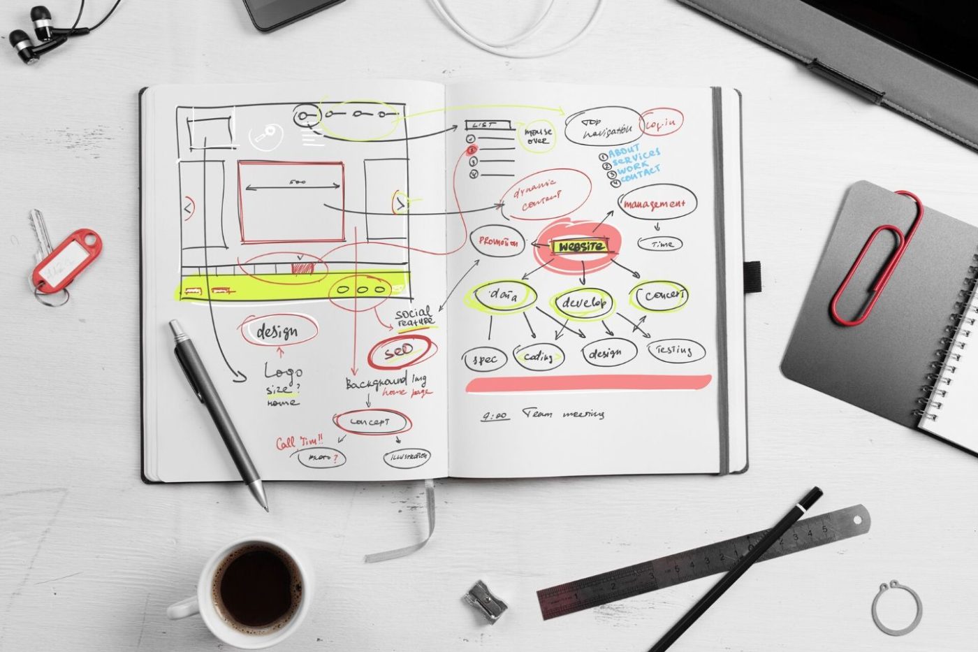
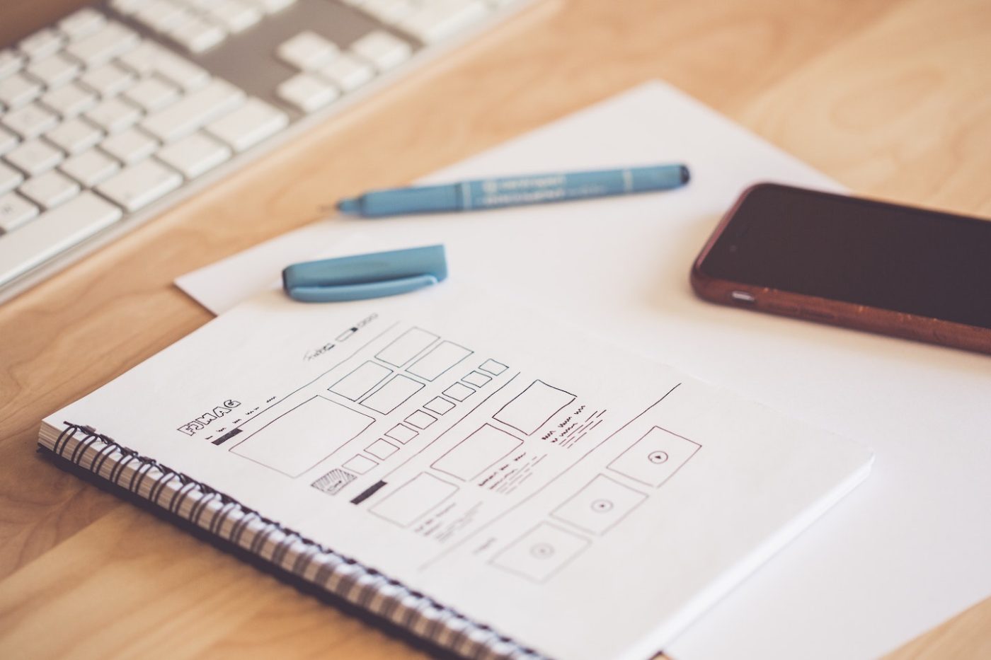
Pro Tip: When brainstorming a homepage layout, the easiest way to see what you want is to draw it out with pen and paper first. This will allow you to play with different homepage elements, see where they fit together and come up with a design plan before actually applying it to your blog.
Navigation Bar
A good navigation bar is crucial to blog design because this is what allows users to easily bounce around your website. Without a navigation bar, readers would be stuck on whatever page they land on, unable to move around as they please.
The navigation bar should point to every major section of your website, giving readers the option to explore your blog with ease.
That being said, not all navigation bars are created equal. Some of them have a few options that line the top of your blog, while others include drop-down menus with expanded choices of places to visit on a website.
No matter what you choose for your blog design, the navigation bar should be prominent and clear to readers, allowing them to move from page to page without hassle.
Remember- your nav bar doesn’t have to be final! This can change as you write about more things, etc.
Sidebar
A sidebar is a really handy element that can be integrated into almost every blog design. And the best part is, most of the time sidebars are really customizable… you just have to decide what you want to put there.
Here are some common elements that appear in blog sidebars:
- Brief author bio with photo
- Latest or most popular posts
- Hot offers or calls-to-action
- Social media feeds
- Maps
- Contact information
Sidebars are highly versatile and really useful components to have on a blog. Just be sure to decide what you want to put there before you begin designing so that you don’t duplicate elements.
One thing to note about sidebars is you should be cautious about the amount of information you include in this space. Don’t overdo it and put too much on the sidebar. It will begin to look cluttered and detract from your blog’s design.
Pick and choose the most important elements and let them showcase themselves.
Images
Another hugely important blog design element to keep in mind is images. Images can be anything from the photos that you upload to make an article more lively to the general branding materials and images you use to convey your blog’s message.
Images are so important because they immediately capture a reader’s attention. If your images are engaging, they’ll have even more of the desired effect on a reader.
Unfortunately, you can’t just head to Google, search for something, and slap any random image on your blog. Instead, you have to choose photos that don’t have a copyright and are free to use.
You can find these photos on websites like Unsplash, Pexels, and Pixabay, but if you can’t locate what you’re looking for, it’s definitely worth it to spring for a premium stock photo membership with DepositPhotos.
Another place to find images is AppSumo which frequently has great deals on stock photo subscriptions and photos that can be used on blogs.
It’s also worth having a few high quality pictures of yourself on your blog, especially on the “About” page or sidebar bio to let people know who’s behind the screen. Photos of you on your blog should be professional, but also convey a message about yourself to readers.
Do you want to be super serious and show authority? More whimsical and fun with your poses or backdrops? These are things to think about and greatly play into your blog design.
If you’re feeling crafty and want to put together images for your blog, we swear by Canva Pro for all of our blog design needs. It can be used for plain old blog images, along with banners, posters, social media, and beyond.
For more on how to use Canva, check out our Canva tutorial!
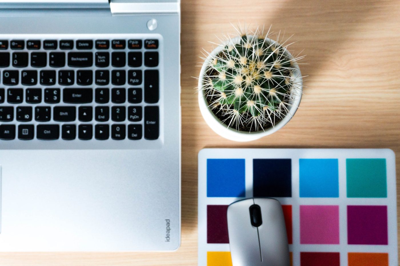
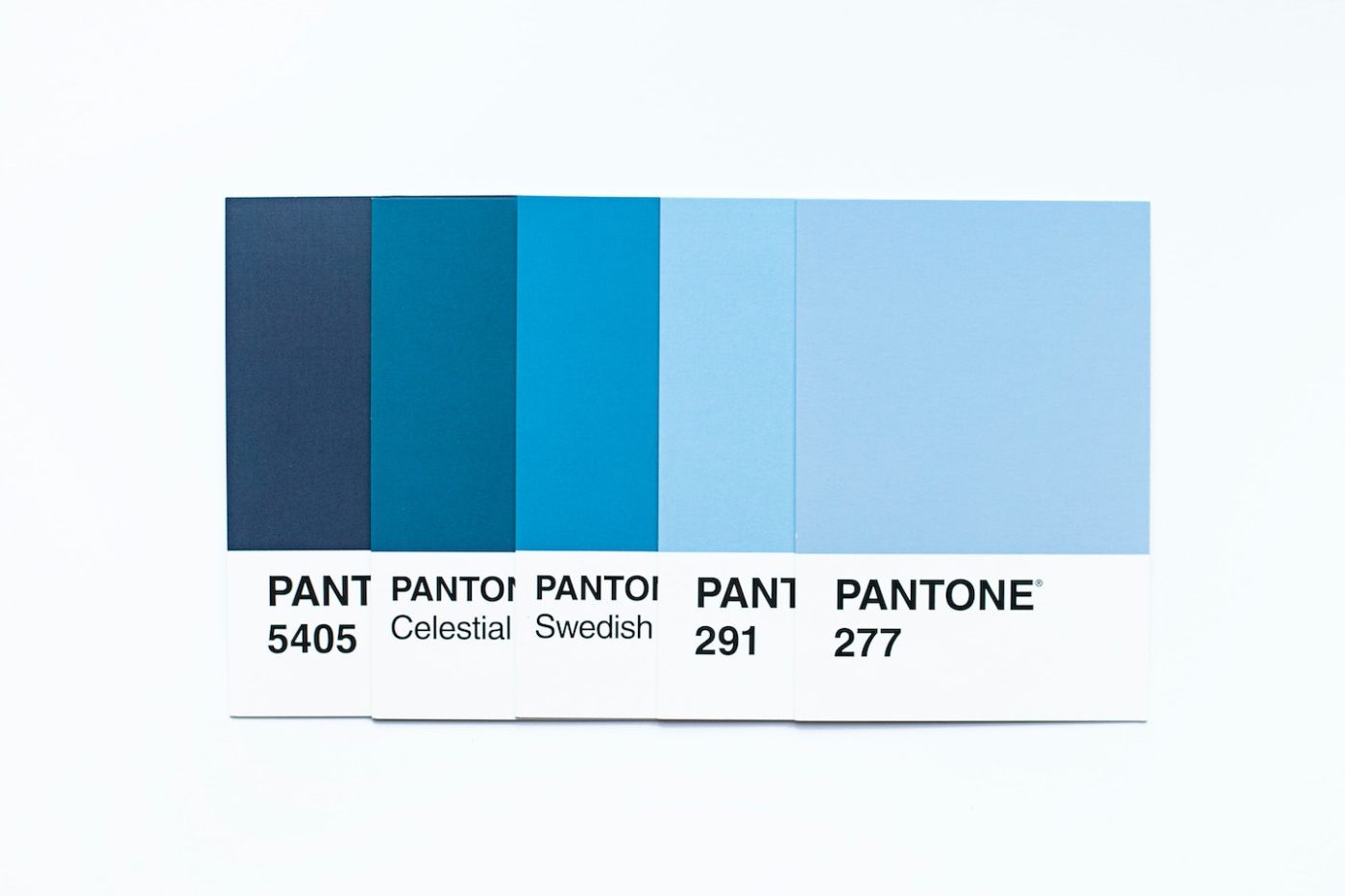
Color Scheme
When it comes to your blog’s design, you want to have something that’s cohesive and well-put together. A set color scheme goes a long way in this department and helps turn a blog into a brand.
A solid color scheme creates cohesion on a blog, as well as consistency throughout the website, branding materials, and images.
With the right color scheme, at a single glance, readers will get the general vibe and feel of your blog. Plus, they’ll easily be able to figure out if something is associated with your blog based on the color scheme.
It’s worth getting to know color theory when it comes to blog design as this will make a huge unconscious impact on your readers. There’s a lot of psychology behind color, leading color schemes to be of the utmost importance when designing anything (blogs included)!
Some tips for color schemes are:
- Keep it simple
- Pick contrasting colors
- Use different shades or tones of the same color
- Look at color wheels
- Understand the relationship between color and emotion (red = urgency, yellow = optimistic, black = powerful, etc…)
Once you decide on a color scheme for your blog, stick with it! You want to create an essence of harmony throughout your blog design. This website allows you to play around with different color combinations which is great. Alternatively, you can also check this color palette inspiration from Canva.
Pro Tip: Be sure to note down the hex code or RGB code of your brand colors so that you can consistently use the exact same colors on every platform you use.
White Space
White space is often an element of blog design that’s overlooked because people simply want to fill their blog up with as much information as possible.
While yes, you want to give your readers adequate knowledge, you also want to keep them focused and on track. White space is great for this!
When used strategically, white space gives the page some breathing room and allows the user to focus on what’s directly in front of them, distraction-free.
For your blog design, keep white space in mind as you add different elements. Is there enough room for the different page elements to breathe? Or do things look cluttered?
Readability of Text
You also want to ensure that your text is readable.
Is the font you’ve chosen easy to read? Is the font size large enough? Is the color dark (or light) enough against the background?
The recommended website font should be at least size 16 or larger.
Remember, the most important component of your blog is the content. As such, it’s ultra important that users are able to actually read it!
Hand in hand with the font, when it comes time to read an article, are you displaying one giant block of text? If so, this won’t do much to help your blog design.
To optimize readability, design articles with different headings, breaks in the text, images, and call-out boxes. Doing this will keep your audience from growing bored or fatigued from having to ingest so much text all at once.
Doing this isn’t just great for general user experience but is also great for SEO (i.e. if you want to get your articles ranking!)
Display Ads
One last blog design element to consider is display ads. Are your ads an eyesore? Or are they well-integrated with your blog design?
You should be aiming for the latter, and include display ads in a tasteful way so as not to detract from your killer content.
Also keep in mind where you choose to display ads.
Could you put something more valuable there? Are you maximizing the amount of eyes that land on the ad? If so, this can affect the amount of money you make through advertising.
Pro Tip: Although display ads are great and can bring in a great chunk of change, we recommend disabling them on affiliate articles to increase conversions.
If you want to learn more tips and tricks like this one, be sure to register for our free online training where my partner Tom and I walk you through everything you need to know about making money through blogging!

Blog Design Examples: 10 Blogs with Amazing Blog Layouts
To help with your own blog design, here are 10 amazing blogs in different niches that you can seek design inspiration from!
Food52
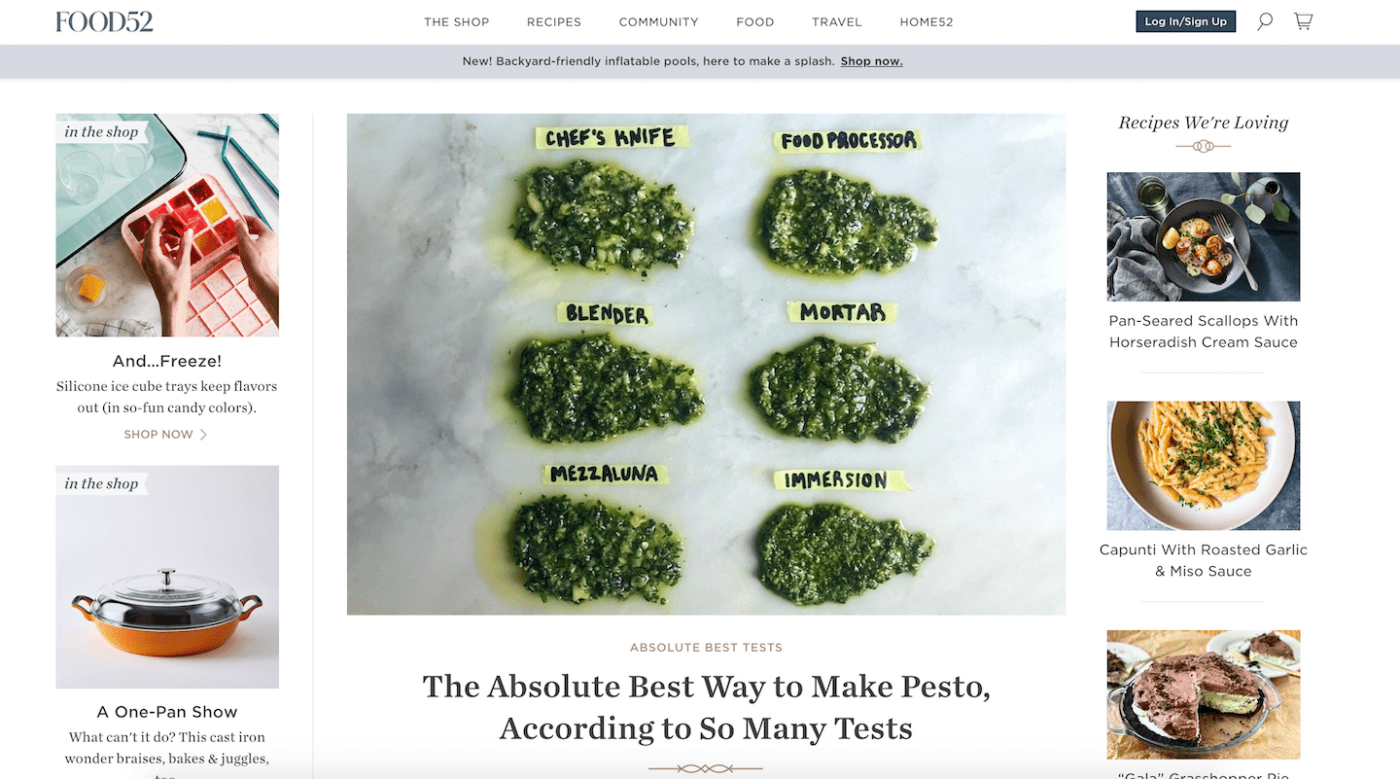
A food blog of dreams, Food52 has gotten their design down pat.
The website’s homepage is eye-catching and full of useful information without being overwhelming. With a 3-column format rather than a banner, their homepage features elements like “shop items”, “latest articles”, and “recipes we’re loving” as soon as your eyes meet the site.
As you continue to scroll down the homepage, readers are greeted with a “join our community” opt-in, more shop items, blog categories with latest articles, and a featured video.
It sounds like a lot, but it’s perfectly balanced with plenty of white space and a neutral color scheme.
What I love most about Food52 is how much they’ve integrated into their blog design without detracting from the meaningful content. There’s a mix of fun fonts, embellishments, and interesting layouts, while providing readers with practical content and fun advice.
Brit+Co
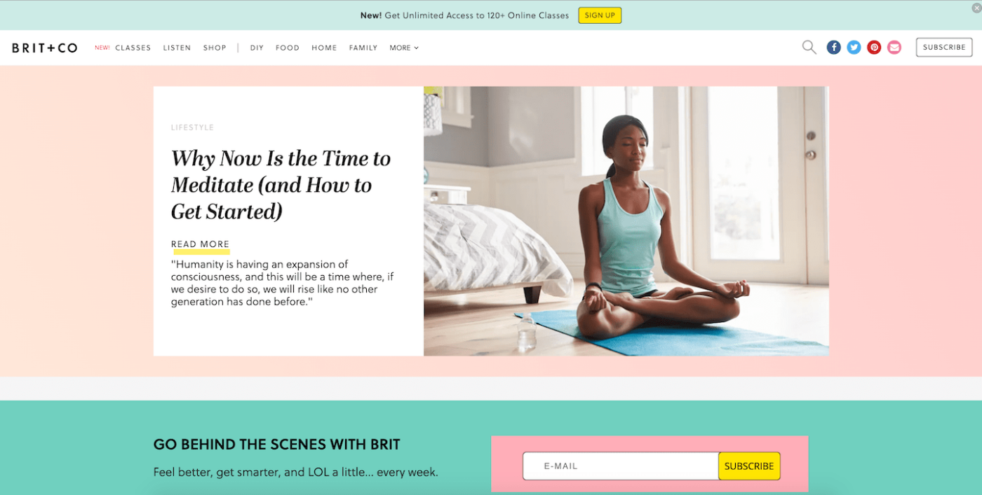
A blog dedicated to women trying new things and pursuing their passions, Brit + Co features bright designs, catchy features, and plenty of content to keep you entertained.
Brit + Co has an unbelievably cute pastel color scheme with light pinks, aqua greens, and bright yellow. Paired with the pop-art style category boxes and whimsical fonts, their blog design certainly stands out from the crowd.
On the homepage, there’s a single main banner with a latest article, and just below is an email opt-in in a bright box for capturing new subscribers. As you continue to scroll down, Brit + Co features this week’s stories and the ability to explore each distinct category.
Brit + Co’s blog posts have plenty of white space as well as plenty of social media icons for sharing favorite pictures to the platform of your choice. It’s balanced, clean and really fun to look at, making it one of my favorite blog designs.
Apartment Therapy
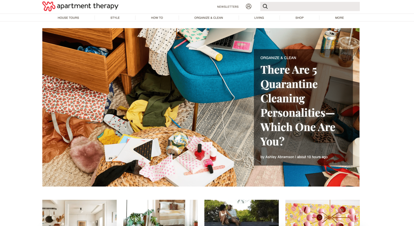
All things home and apartment, Apartment Therapy is a top website in my books when it comes to appealing blog design.
The homepage is big and bold, with featured articles loud and proud and miscellaneous content in small boxes below. The homepage alternates between individual articles and groups of articles, allowing you to pick what suits your fancy.
As you continue to scroll down, Apartment Therapy also has a featured video section with a scroll function that allows you to watch more than one.
I really like that each article listed on the homepage has a red category tag so that readers can easily understand what kind of content to expect. The homepage also has an endless scroll function where readers are able to find articles directly on the page they land on.
Like the rest of the website, Apartment Therapy’s blog posts are bold and clean, with plenty of white space and the token red, white, and black color scheme that stays consistent throughout the site.
Collective Gen
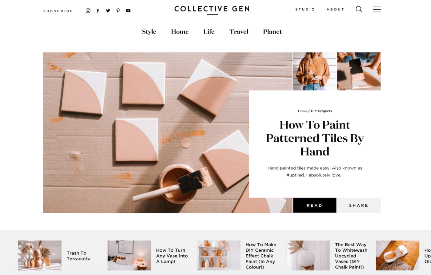
An alluring lifestyle blog, Collective Gen has a standout design that draws readers in and keeps them on the website.
To show off articles on the homepage, Collective Gen has a mosaic of images coupled with a white text box featuring the article title, the first sentence, and the category tag. Utilized on the homepage, this design gives the blog plenty of white space without sacrificing multiple visuals for one article.
Collective Gen has a homepage sidebar with a value gift email opt-in, social media icons, and a call-to-action for a book that the blogger has written.
What I really like is as you continue to scroll, the sidebar is broken up to make space for a full-width video player, but then picked back off to display popular posts.
This blog design utilizes a neutral color palette, plenty of white space and black text, and fonts that pop. It also has a mega menu that expands when hovered over to show additional categories and top posts.
I truly can’t get enough of this blog design!
Teach Mama
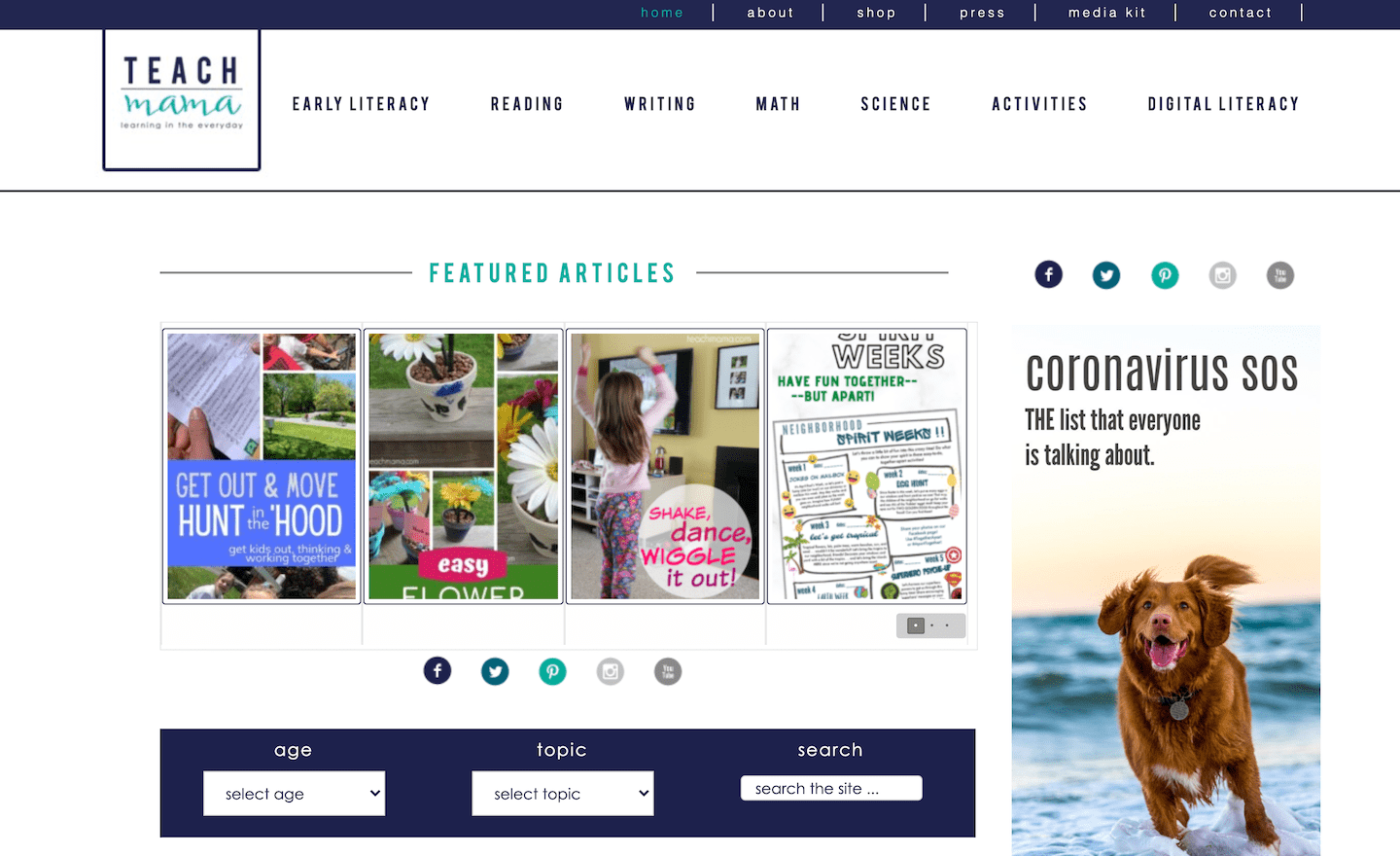
Just because you’re a mom doesn’t mean you can’t have a beautifully designed blog. Just take Teach Mama for example!
This blog has a really standout design that makes it ultra-easy to find what you’re looking for, plus a distinctly personal feel to it.
The homepage of Teach Mama has a featured posts slider and just below it is a filter function where readers can pick an age range, topic and then search the entire site for related content. This is a really clever design element that entices users even further because they can narrow down results to directly cater to them!
Teach Mama makes good use of a sidebar that has relevant articles, website navigation, and an email subscription box. This sidebar remains in blog articles, which is a good design function because it allows people to quickly navigate to where they want to go next.
With a navy, aqua, and white color scheme, Teach Mama’s blog design is simple yet compelling, making it one of my top picks.
Love Sweat Fitness
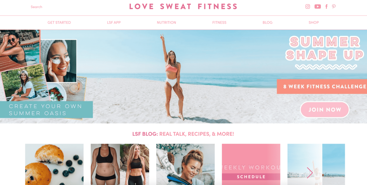
A blog design that packs a punch, Love Sweat Fitness is stellar in the visual department and totally captivating for anyone who lands here.
First, let’s talk colors. While I’m not super girly, I love the way Love Sweat Fitness makes use of pink on her blog. Instead of just a single shade, she uses different hues of pink to create a cohesive color scheme for her blog.
Another thing I love about Love Sweat Fitness is the images used. Her graphics are clean and compelling, and the images used for article features are tasteful and alluring.
Instead of packing the entire homepage with articles, Love Sweat Fitness keeps it simple. While there is a handful of content featured in a sliding banner at the beginning of the homepage, as you scroll down, you’re met with different elements like categories, email sign-up, the community Instagram page, and a call-to-action for an app download.
What I really like here is Love Sweat Fitness also integrated their core values on the homepage for readers to find as soon as they land on the website.
Beautifully designed with content to kill, Love Sweat Fitness is an exceptionally good-looking blog.
Salt in Our Hair
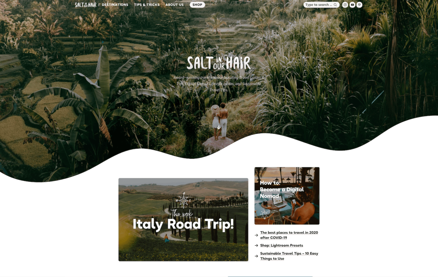
Another one of my all-time favorite blog designs, Salt in Our Hair is funky and different, with a design that is nothing short of enchanting. This travel blog is full of fun shapes, playful fonts, and earthy colors, creating an all-around united and attractive website.
Instead of the standard rectangles and squares, Salt in Our Hair makes use of different shapes to display blog elements. The homepage is simple but shows off key articles, categories, and a digital product, as well as plenty of social media icons and a brief “about” section.
They keep the navigation bar hyper simple with only 4 elements on it, with subtags within each category to help readers find what they’re looking for with ease.
Blog posts are just as enticing as the homepage, with a curved featured image and a short sidebar displaying more articles and website discounts.
The reason I love Salt in Our Hair so much is because they remind us how original we can be with our blog design. Blog design doesn’t have a single format, so don’t forget to be fun with it like they are here!
The more unique your blog design is, the more memorable it will be.
Good On You
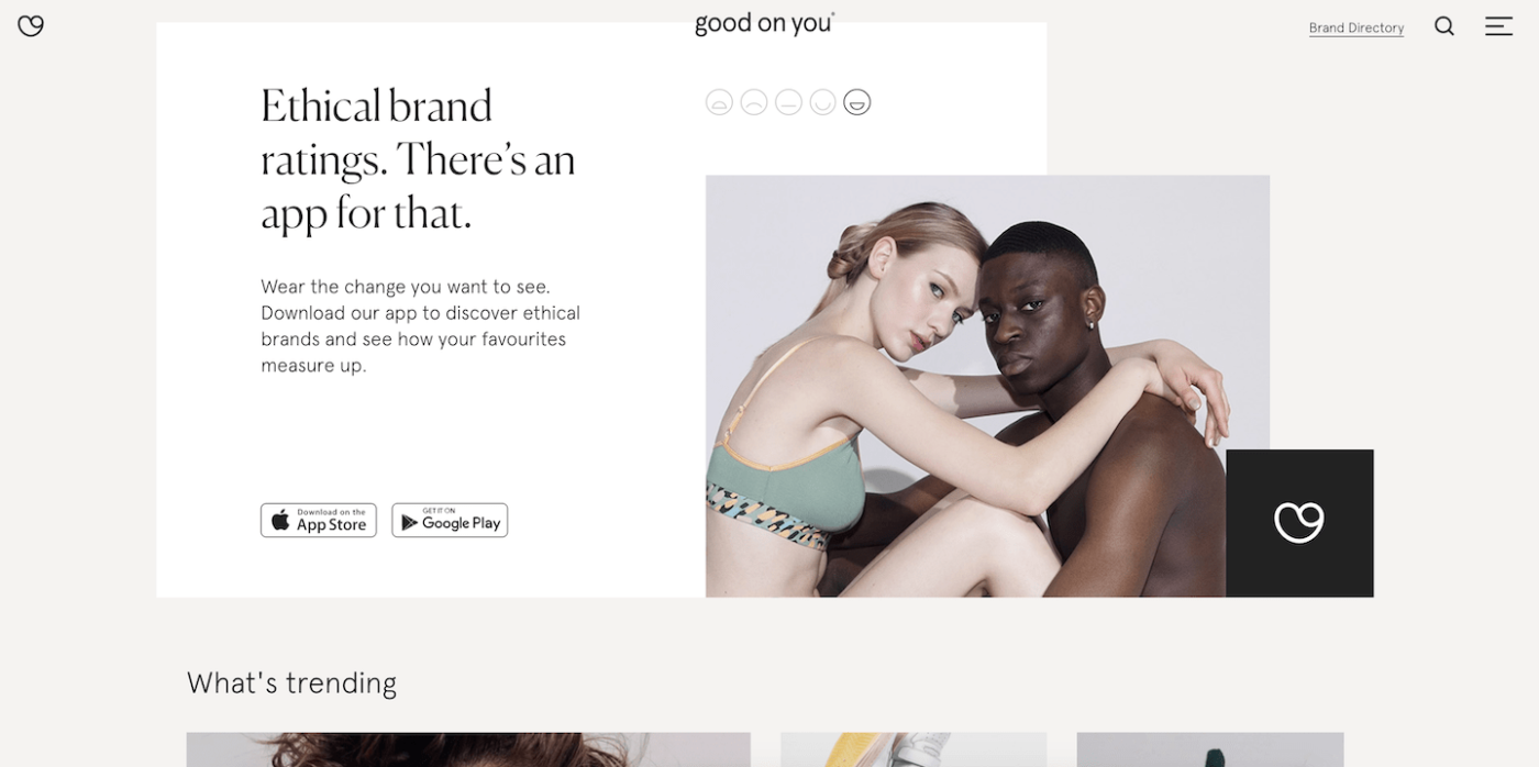
A design-heavy fashion blog, Good on You is funky and different while keeping things classy and simple.
The homepage is a geometric mashup of different rectangle sizes displaying article after article. Everything is kind of collaged onto the page instead of snapping to a grid, making it more compelling to look at and scroll through.
As you make your way to the bottom of the homepage, there’s a list of blog topics to choose from, with a small number next to the category denoting how many articles are written on the subject.
Just below, there’s also a witty email opt-in.
Little things like these round out Good on You’s blog design and make it a really fun place to hang out online.
Good On You’s blog posts are more compelling than most, with lovely features integrated into the design. For example, when products are being reviewed, there’s a left sidebar with a rating option where the author chooses a happy or sad face based on their feelings of the product… Pretty unique, right?
Instead of having a top navigation bar, it’s in a collapsible menu on the side that has the website directory along with all the social channels to follow.
I love this design and love this blog!
Garden Therapy
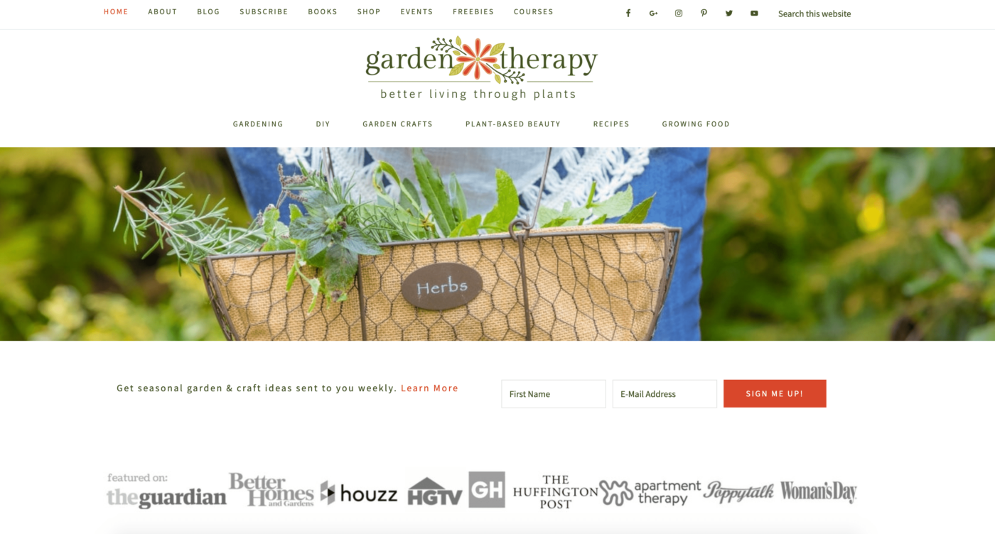
A simple but highly functional gardening blog, Garden Therapy has a familiar design that’s easy to use and simple to duplicate on anyone’s own blog.
Garden Therapy has not one but TWO navigation bars – one at the very top of the homepage with different places to visit on the blog, with the second one below the logo heading that depicts blog post categories.
The email opt-in is also placed early on the homepage to capture the reader’s information before they navigate to elsewhere on the website.
Garden Therapy has done an outstanding job of building her credibility by displaying publication features right on the homepage without disrupting the design of the website.
I really like the way Garden Therapy has things set up. There’s a nice flow to the blog where the author can show off key pieces of the website, give readers a rundown of who’s behind the screen, and place strategic calls-to-action to bring home the bacon.
I also love the design of Garden Therapy’s blog posts, with an original date box at the top to show when it’s been published and category tags under the title. Blog posts have a sidebar with author info, email sign up, and gardening books, really rounding out the page.
Mind Body Green
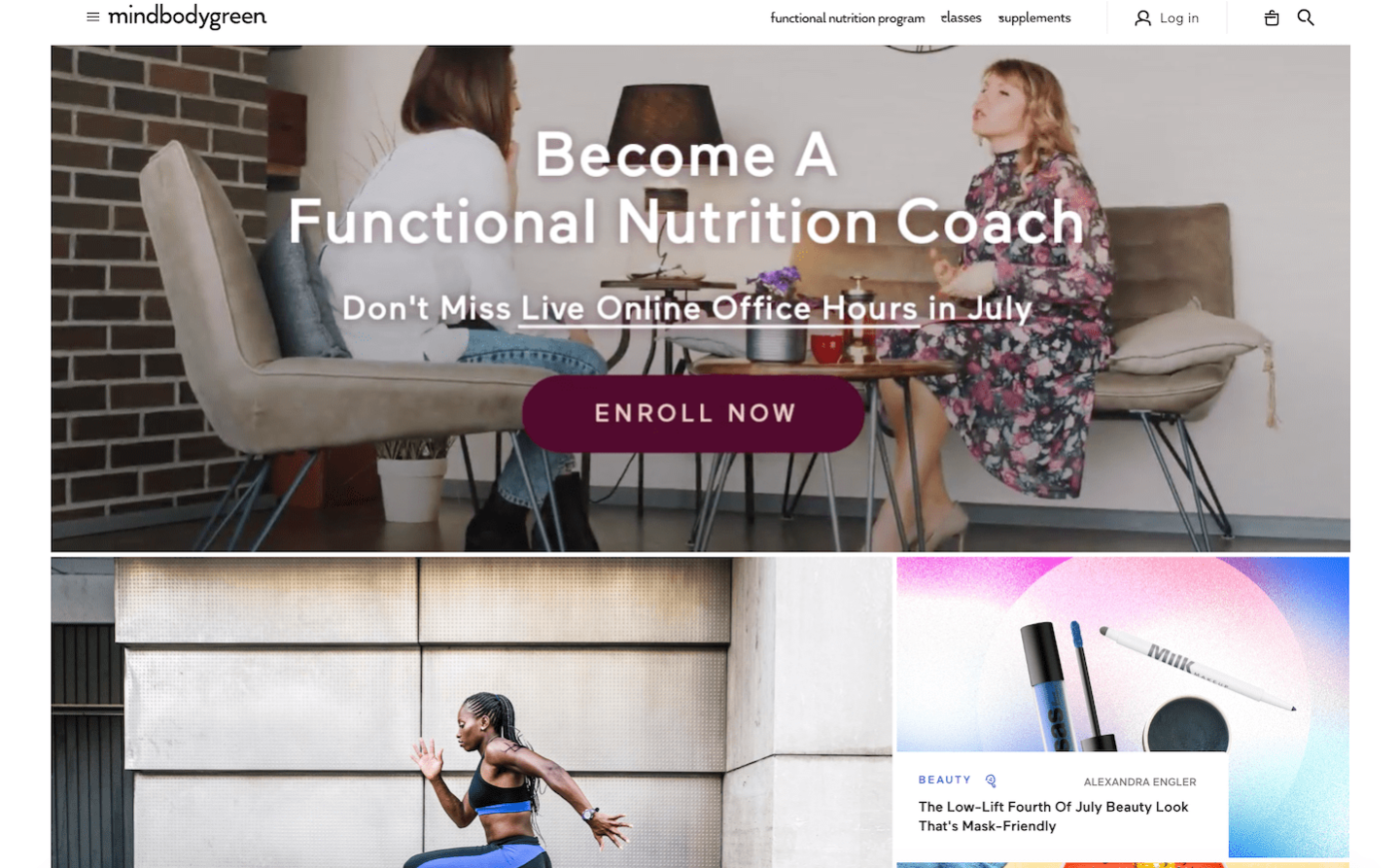
One last blog design I can’t get enough of is Mind Body Green. This wellness blog has pulled out all the stops to create a stunning blog design that stands out from the crowd and captivates readers.
Mind Body Green has an impeccable balance of white space and bold elements like images, calls-to-action, and titles. The font is simple but direct, with a bright color scheme with hues of blue, orange, peach, purple, and green.
I really like the way they utilized color with this blog design as each category has their own unique color tag!
The homepage layout is a mosaic style, with a video header at the top with a strong call-to-action. Besides articles on the homepage, there is also a sidebar with latest news, upcoming trainings, product sales, and beyond.
Blog posts on Mind Body Green are unique, with elements like a slider on the top to show how far through the article you are and plenty of bold headings and bullet points, making the content ultra readable.
There’s so much to take away from Mind Body Green’s blog design!
After examining different elements and several well-designed blogs, hopefully you feel much more equipped when it comes to designing a blog of your own!
Remember, the impression you give visitors when they first lay eyes on your blog is what’s going to stick with them… so you may as well make it a killer first impression.
It may be intimidating to think about designing a blog all on your own, but luckily today, you don’t need to be a pro web designer or tech guru to get your blog looking just right.
Instead, you can use a WordPress theme!
While not all themes are made equally, there are some standout ones like Divi which comes with a visual page builder, allowing users to easily create a good-looking blog with very little hassle.
Beyond Divi, check out these articles to find the theme of your dreams and get your blog design going today:
- Best Food Blog WordPress Themes
- Best Elementor Themes
- Best Lifestyle Blog WordPress Themes
- Best WordPress Themes for Travel Blogs
Like this Article? Pin it!